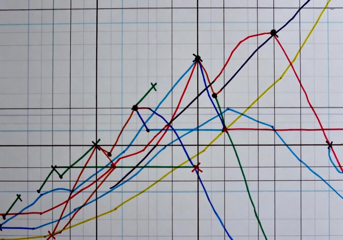
In the modern world, data and statistics shape nearly every aspect of our lives, from news reports to corporate presentations. But how often do we stop to question the reliability of the graphs we see? While a visual representation can instantly help us grasp a dataset consisting of countless rows and columns, it can also be one of the most effective ways to **distort the truth**. A simple change in an axis, the misuse of a pie chart, or a selective timeframe can deliberately reverse the story the data is telling. Understanding these tricks is crucial to becoming a truly data-literate citizen.
1. Trick #1: The Truncated Y-Axis Trap
One of the most common and insidious methods of creating a misleading graph is by **failing to start the Y-axis (the vertical axis) at zero.** Imagine a bar chart where the axis begins at 90 instead of 0. If a value increases from 101 to 105, that is only a **4% increase** in reality. However, by starting the Y-axis at 90, the bar representing 105 can appear to be five times longer than the bar representing 101.
This visual illusion is frequently employed in financial reports, political polls, and media headlines to make minor differences look like a **massive crisis** or an **overwhelming success**. While the chart screams dramatic change, the underlying data may only show an insignificant fluctuation. The only way to spot this deception is to always read the axis labels carefully, particularly checking the starting point of the vertical scale.
2. Trick #2: Missing Context and Selective Timeframes
A visualization can become misleading when it strips the data of its essential context.
Manipulating the Timeline
An analyst trying to show growth in a stock's value might choose to only display a chart covering the last month's spike, conveniently concealing the fact that the stock has been steadily declining over the last five years. The **timeframe of the data** fundamentally changes the conclusion presented. Selecting a starting point that represents an arbitrary low (a trough) or an ending point that represents an arbitrary high (a peak) is a simple yet powerful way to manipulate the chart's narrative. Always demand to see the data over a longer, more representative period.
The Pie Chart Fallacy (Exceeding 100%)
Pie charts (or circle graphs) should exclusively be used to show parts of a whole (i.e., they must sum up to **100%**). However, misleading charts sometimes use this format to display survey results where respondents could select multiple categories, causing the total to exceed 100%. Visually, this distorts the perceived importance of each category and prevents the viewer from correctly understanding the true overall magnitude of the data set.
3. Visual Distortions: 3D Charts and Area Illusions
The graphic design itself can be a tool of deception. **Three-dimensional (3D) charts**, particularly in pie or bar formats, frequently create **perspective distortions**. For instance, in a 3D pie chart, the slices closer to the foreground appear larger to the viewer, while the true size of the slices in the background is underestimated.
Furthermore, the use of **unscaled icons** to represent data is a common visual trick (e.g., using growing images of money to show revenue increase). If a value is doubled, and the designer doubles the height of the icon, the icon's **area** (and volume, if 3D) increases by **four times**. Since the human eye naturally interprets the size or volume of these icons, a perception is created that the increase was four times greater than the actual effect. This creates an illusion of wildly **disproportionate growth**.
Knowing these tricks is fundamental not just to being data-literate, but to being a critical thinker. Whenever you encounter a graph, always ask yourself: **Does the Y-axis start at zero?** **Is the timeframe sensible?** and **Does the visual design (3D, icons) distort the data?** These simple checks will protect you from intentional data manipulation and allow you to see the real story behind the numbers.
Understanding the hidden stories behind data can be your superpower in the modern world. Visit our Science category for more articles on statistics and data literacy!